Feature Blocks Grid
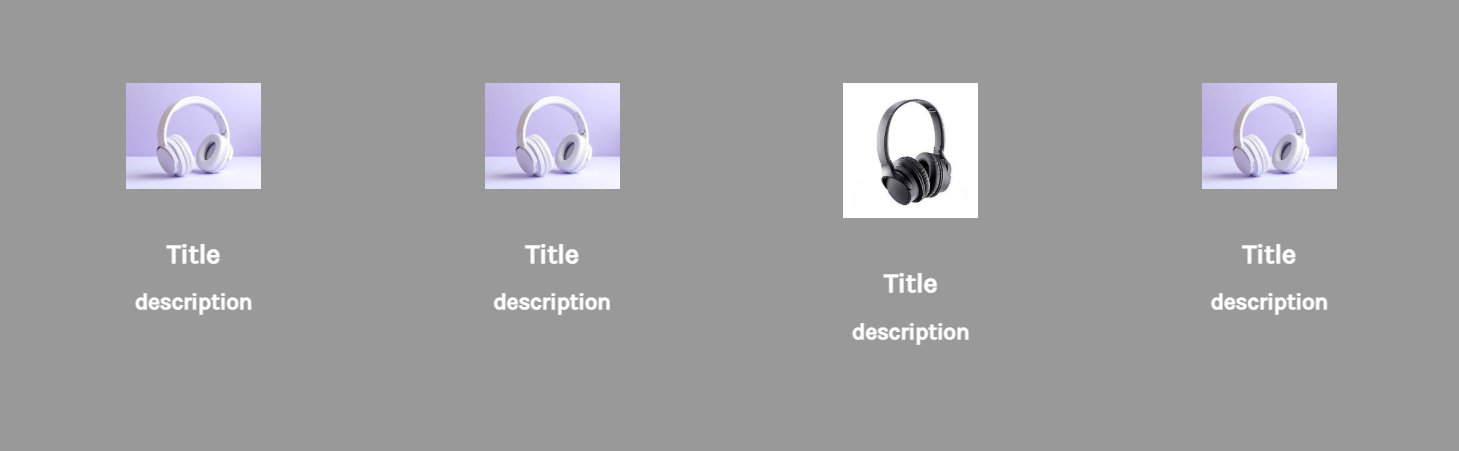
Actual screenshot with sample data
A sophisticated 4-column feature grid system with dynamic SVG gradient icons, comprehensive typography controls, and responsive layouts. Perfect for showcasing product features, services, or value propositions with visual impact.
Overview
The Feature Blocks Grid widget provides a flexible and visually appealing way to display key features, services, or value propositions in a structured grid format. With support for both images and custom SVG icons, dynamic gradient application, and extensive styling controls, this widget offers unparalleled customization for creating engaging feature sections.
Key Features
Dynamic Icon System
- Dual Icon Support: Choose between images or custom SVG icons
- Automatic Gradient Application: JavaScript-powered SVG gradient fills
- Custom Icon Sizing: Separate width/height controls for desktop and mobile
- Gradient Color Customization: Two-color gradient system with rotation
Responsive Grid Layout
- 4-Column Desktop: Quarter-width feature blocks on large screens
- 2-Column Tablet: Half-width layout on medium screens (767px - 1024px)
- 1-Column Mobile: Full-width stacked layout on small screens
- Flexible Container: Auto-height adjustment with consistent spacing
Advanced Typography
- Separate Desktop/Mobile Controls: Individual styling for each breakpoint
- Complete Font Controls: Weight, style, size, and color customization
- Title & Description Styling: Independent controls for hierarchy
- CSS Custom Properties: Dynamic theming through CSS variables
Visual Customization
- Background Color: Full section background customization
- Icon Dimensions: Precise control over icon sizing
- Spacing System: Consistent padding and gap management
- Content Alignment: Centered text and icon presentation
Configuration Options
Block Content Settings
Individual Block Configuration (4 Blocks)
Each feature block includes:
| Setting | Type | Default | Description |
|---|---|---|---|
| Icon Type | Select | Image/HTML Code | Choose between image or SVG icon |
| Image | Image Manager | Unsplash placeholder | Icon image upload |
| HTML Code | Code Editor | SVG code | Custom SVG icon code |
| Title Text | Text | "Title" | Feature block heading |
| Description Text | Text | "description" | Feature description |
Styling Controls
Title Styling
| Setting | Desktop Default | Mobile Default | Description |
|---|---|---|---|
| Color | #ffffff | #FFFFFF | Text color |
| Font Weight | 700 | 700 | 100-900 range |
| Font Style | normal | normal | Normal/Italic |
| Font Size | 24px | 24px | Custom pixel size |
Description Styling
| Setting | Desktop Default | Mobile Default | Description |
|---|---|---|---|
| Color | #FFFFFF | #FFFFFF | Text color |
| Font Weight | 700 | 700 | 100-900 range |
| Font Style | normal | normal | Normal/Italic |
| Font Size | 20px | 20px | Custom pixel size |
Icon Settings
| Setting | Desktop | Mobile | Description |
|---|---|---|---|
| Gradient Color 1 | #F3E188 | - | First gradient color |
| Gradient Color 2 | #CC3B58 | - | Second gradient color |
| Width | 120px | 100px | Icon width |
| Height Type | Auto/Custom | Auto/Custom | Height behavior |
| Custom Height | 40px | 40px | Fixed height (if custom) |
General Styling
- Background Color: #000000 (default) - Section background
- Container Padding: 40px top/bottom, 20px sides (desktop)
- Block Gap: 30px consistent spacing