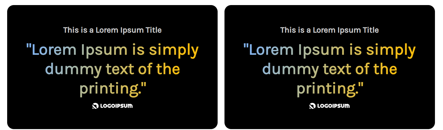
Actual screenshot with sample data
A modern dual-card layout designed to showcase testimonials, press quotes, or product reviews with sophisticated gradient text effects and seamless brand logo integration. Perfect for building social proof and credibility through compelling customer endorsements and media recognition.
Overview
The Quote Cards Widget provides an elegant two-card layout system that enables side-by-side presentation of quotes, testimonials, or reviews. With advanced gradient text effects, flexible logo integration, and comprehensive responsive controls, this widget creates visually striking social proof elements that capture attention while maintaining readability and brand consistency across all devices.
Key Features
Advanced Visual Design
- Gradient Text Effects: Dynamic color gradients for quote text
- Dual Card System: Two independently customizable cards
- Individual Background Colors: Separate colors for each card
- Rounded Container Design: 20px border radius for modern appearance
Responsive Layout System
- Desktop Side-by-Side: Equal-width cards with 20px gap
- Mobile Stacked Layout: Full-width cards in vertical stack
- Flexible Container: Auto-height adjustment with minimum height
- Content Centering: Perfect vertical and horizontal alignment
Typography & Styling
- Separate Device Controls: Independent desktop/mobile typography
- Gradient Color Customization: Dual-color gradient systems
- Font Style Options: Normal and italic text variations
- Comprehensive Weight Controls: 100-900 font weight range
Brand Integration
- Dual Logo Support: Both image logos and SVG icons
- SVG Color Customization: Individual color control per card
- Automatic Icon Filtering: Smart brightness and inversion
- Flexible Sizing: Custom width and height controls
Configuration Options
Card Content Configuration
Card 1 Settings
| Setting | Type | Default | Description |
|---|
| Title | Text | "Test Title" | Card heading text |
| Content | Text | "test content" | Quote or testimonial text |
| Background Color | Color | #000000 | Card background color |
| Logo Type | Select | Image/SVG | Logo format selection |
| Image Logo | Image Manager | Layer logo | Upload logo image |
| SVG Code | Code Editor | Custom SVG | SVG icon code |
| SVG Color | Color | #ffffff | SVG icon color |
Card 2 Settings
| Setting | Type | Default | Description |
|---|
| Title | Text | "Test title" | Card heading text |
| Content | Text | "Test content" | Quote or testimonial text |
| Background Color | Color | #000000 | Card background color |
| Logo Type | Select | Image/SVG | Logo format selection |
| Image Logo | Image Manager | Business Insider | Upload logo image |
| SVG Code | Code Editor | Custom SVG | SVG icon code |
| SVG Color | Color | #ffffff | SVG icon color |
Typography Settings
Title Styling
| Setting | Desktop Default | Mobile Default | Description |
|---|
| Color | #CECECF | #CECECF | Title text color |
| Font Weight | 700 | 500 | Bold/medium weight |
| Font Size | 24px | 18px | Responsive sizing |
| Font Style | Normal | Normal | Text styling |
Content Styling
| Setting | Desktop Default | Mobile Default | Description |
|---|
| Gradient Color 1 | #F3E188 | #F3E188 | First gradient color |
| Gradient Color 2 | #CC3B58 | #CC3B58 | Second gradient color |
| Font Weight | 700 | 700 | Bold weight |
| Font Size | 48px | 32px | Responsive sizing |
| Font Style | Normal | Normal | Text styling |
Icon & Logo Settings
Desktop Icon Controls
| Setting | Type | Default | Description |
|---|
| Width | Number | 120px | Icon width |
| Height Type | Select | Auto/Custom | Height behavior |
| Custom Height | Number | 40px | Fixed height (if custom) |
Mobile Icon Controls
| Setting | Type | Default | Description |
|---|
| Width | Number | 100px | Icon width |
| Height Type | Select | Auto/Custom | Height behavior |
| Custom Height | Number | 40px | Fixed height (if custom) |