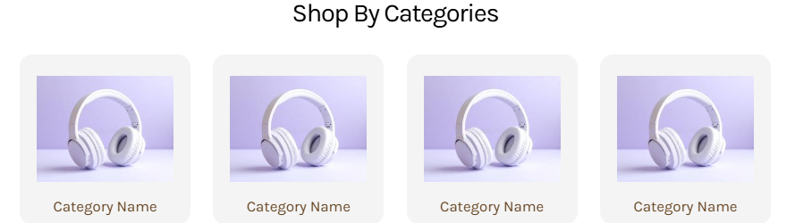
Actual screenshot with sample data
A sophisticated responsive category navigation system that transforms product discovery through visually appealing grid layouts. This widget enables merchants to showcase product categories with customizable cards, optimized imagery, and seamless responsive behavior across all devices.
Overview
The Shop By Category Grid widget provides an intelligent grid-based navigation system that automatically adapts to different screen sizes while maintaining visual consistency. With advanced typography controls, flexible image management, and smart responsive layouts, this widget serves as a cornerstone for effective e-commerce navigation and product categorization.
Key Features
Smart Grid Layout System
- Auto-adjusting Desktop Grid: Dynamic columns that adapt to container width
- 2-Column Mobile Layout: Optimized for touch interaction and mobile browsing
- Intelligent Odd Item Handling: Centers single items in mobile view for balanced appearance
- Consistent Aspect Ratios: Maintains 1:1 proportions across all cards
Advanced Visual Customization
- Individual Card Backgrounds: Custom colors for each category card
- Flexible Image Padding: Precise control over image positioning within cards
- Rounded Corner Design: Modern 12px border radius for contemporary appearance
- Smooth Hover Effects: Transform and shadow transitions for interactive feedback
Responsive Typography System
- Device-Specific Heading Controls: Separate desktop and mobile typography settings
- Comprehensive Font Controls: Weight, size, line height, and letter spacing
- Category Label Styling: Independent typography for category names
- CSS Custom Properties: Efficient variable-based styling system
Professional Image Management
- Optimized Image Containment: Object-fit contain for perfect image presentation
- Background Color Integration: Custom backgrounds for image containers
- Flexible Aspect Ratios: Consistent 1:1 container proportions
- Accessible Alt Text: Automatic alt text generation from category labels
Configuration Options
General Settings
| Setting | Type | Default | Description |
|---|
| Main Heading | Text | "Shop Top Categories" | Primary section heading text |
Heading Typography Settings
Desktop Typography
| Setting | Type | Default | Description |
|---|
| Color | Color | #000000 | Heading text color |
| Font Size | Number | 24px | Text size in pixels |
| Font Weight | Select | 300 | Font weight (100-900) |
| Line Height | Number | 34px | Line spacing in pixels |
| Letter Spacing | Number | -1px | Character spacing adjustment |
Mobile Typography
| Setting | Type | Default | Description |
|---|
| Color | Color | #000000 | Heading text color |
| Font Size | Number | 16px | Text size in pixels |
| Font Weight | Select | 400 | Font weight (100-900) |
| Line Height | Number | 34px | Line spacing in pixels |
| Letter Spacing | Number | -1px | Character spacing adjustment |
Category Name Typography
| Setting | Type | Default | Description |
|---|
| Font Weight | Select | 500 | Category label weight (100-900) |
| Font Size | Number | 14px | Label text size |
| Line Height | Number | 20px | Label line spacing |
| Letter Spacing | Number | 0px | Label character spacing |
| Category Color | Color | #654321 | Label text color |
Image Settings
| Setting | Type | Default | Description |
|---|
| Image Padding | Box Model | 16px top/bottom | Padding around category images |
Category Configuration
| Setting | Type | Default | Description |
|---|
| Category Image | Image Manager | Default product image | Category visual representation |
| Background Color | Color | #f4f4f4 | Card background color |
| Category Name | Text | "Category" | Display label for category |
| Category Link | URL | "#" | Navigation destination URL |