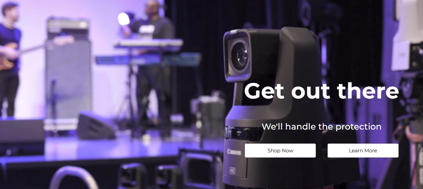
Actual screenshot with sample data
A high-conversion hero section with separate desktop/mobile images, flexible content alignment, multiple CTA layouts. Designed to create compelling above-the-fold experiences that drive user engagement.
Overview
The Hero Banner widget provides a sophisticated, responsive hero section solution with separate image optimization for desktop and mobile devices. With comprehensive content alignment controls, multiple button arrangement options, and advanced image focus point management, this widget enables the creation of high-impact landing experiences that adapt perfectly to every screen size.
Key Features
Advanced Image Management
- Separate Desktop/Mobile Images: Optimized visuals for each device type
- Focus Point Controls: Precise image cropping with percentage-based positioning
- Overlay Opacity: Adjustable black overlay for mobile text readability
- Background Optimization: Efficient loading with eager decoding for critical images
Flexible Content Alignment
- 9-Position Desktop Layout: Full grid alignment (top/center/bottom × left/center/right)
- 3-Position Mobile Layout: Optimized vertical alignment for mobile devices
- Independent Controls: Separate desktop and mobile alignment settings
- Flexbox-Based: Modern CSS layout for consistent positioning
Multiple CTA Arrangements
- 2×2 Grid Layout: Balanced button arrangement for multiple actions
- Vertical Stack: Single column for clear action hierarchy
- Horizontal Row: Inline buttons for compact layouts
- Mobile Optimization: Automatic vertical stacking on small screens
Configuration Options
Background Settings
Desktop Background
| Setting | Type | Default | Description |
|---|
| Background Image | Image Manager | default image | High-resolution desktop image |
| Focus Point | Range (0-100%) | 20% | Horizontal focal point for cropping |
Mobile Background
| Setting | Type | Default | Description |
|---|
| Background Image | Image Manager | default | Optimized mobile image |
| Focus Point | Range (0-100%) | 52% | Horizontal focal point for cropping |
| Black Overlay | Range (0-1) | 0 | Overlay opacity for text readability |
Content Configuration
Heading Settings
| Setting | Desktop Default | Mobile Default | Description |
|---|
| Heading Text | "Default Heading" | - | Main hero message |
| Heading Tag | H1 | - | Semantic HTML tag (H1-H6) |
| Font Size | 62px | 40px | Responsive typography |
| Font Style | Normal | Normal | Normal/Italic styling |
Sub-heading Settings
| Setting | Desktop Default | Mobile Default | Description |
|---|
| Sub-heading Text | "Default sub heading text" | - | Supporting message |
| Sub-heading Tag | H3 | - | Semantic tag (H2-H6, P) |
| Font Size | 24px | 18px | Responsive sizing |
| Font Style | Normal | Normal | Text styling |
Styling & Alignment
General Styles
| Setting | Desktop | Mobile | Description |
|---|
| Text Color | #FFFFFF | #FFFFFF | Content text color |
| Content Alignment | Right/Middle | Center/Middle | Horizontal/vertical positioning |
| Setting | Options | Default | Description |
|---|
| Button Arrangement | Grid, Column | Grid | Layout pattern |
| Button Visibility | Show/Hide | Show (Button 1) | Individual button control |
| Button Text | Custom | "Shop Now" | Action text |
| Button URL | URL | "/" | Navigation destination |
| Button Color | White, Black | White | Color scheme |